Wednesday, August 15, 2012

Reeder Mac App Review

I've been looking for an alternative for a while now, to replace the aging Netnewsire (which does not seem to be maintained any longer). A prime candidate, or a much touted one at least, is Reeder. It is available in the Mac App store for $4.99 at the moment, so I decided to give it a run. Note that initially the application was closer to $9.99, so the price has gone down. I will conduct this review in comparison with my current RSS feed reader, being Netnewsire, in terms of customizability, user experience, and features. This review will reflect my workflow when it comes to RSS feed readers so our opinions might differ. I will then go through an in-depth comparison of every preference in each application and talk about various pros and cons. I will show screenshots from both applications, where I have similar RSS feeds set up for each. I will have more folders for netnewswire because I archive the articles in the application itself as I do not have google reader sync set up (more on that later).

General Interface
Netnewswire


Reeder


In terms of interface they are pretty similar. The both sport a three paned interface, where on the far left are the subscriptions and folders/tags, in the middle of the application are the headlines, and on the far right are the article shorts. Reeder also has a more compact view where the far right pane is not present. Netnewswire also supports this more compact view (called the "combined view"), but in addition has the traditional view (where instead of the screen being split into middle and right pane it contains a top and bottom pane, with the left side containing the subscription list).

Preferences
If you haven't downloaded this app (I do not believe there is a trial available) I am going to post screenshots of all of the available preferences in reeder and compare them to netnewswire (and discuss whether there is feature parity, or whether one app has more options than the other).

General

One thing I really like about Reeder is the built in, "defaulted" google reader support. This makes it so much easier to read RSS feeds when you are on the go and don't have your computer with you. I have tried out google reader support in netnewswire but I found the feature to be quite buggy, and every time I try to sync my feeds there would be duplicate feeds shown in netnewswire. This process is far more seamless in Reeder. Another option part of Reeder is "readability," which appears to be a service that makes it easier to view webpages (similar to safari's reader feature), where it focuses only on the article and takes out other headers and footers that the website may have. While this does seem to be a useful feature I found it perplexing that this feature is baked into the application itself. At the bottom of the application there will always be a "readability" button, and there is no way to disable this (more on this later). Reeder also has the capability to put the unread count number as part of the application icon itself on the dock. Though it is possible to change it back to the "badge" style that is present in netnewswire.

Appearance

Even though there are a fair number of sliders in this preference pane I found the options to be quite limited. I personally like having the style similar to that of Mac OS X, so I adjusted it as such. However, in the end I was still not totally satisfied with the result. On netnewswire whole themes are available to change the entire interface of the application, and this is not available for Reeder. Even though this is a setback, it does not affect the user experience. On a side note, one thing I've always hated about the newer versions of Mac OS X (lion and mountain lion) are the monochromatic color schemes.

Syncing

Synching settings are pretty familiar, nothing much to note here. I like that you can configure how long to keep read items though overall it is feature parity with netnewswire.

Services

Now this is where it gets interesting. Netnewswire has many services built into the application, but its age shows especially when compared to reeder. I was quite pleased to see services such as evernote, safari reading list, and pocket (read it later) to be part of the list. Admittedly I have only started using such features not too long ago, but I found it very nice that Reeder supports that many services. As well, when enabled there is an option to have the service show up as an icon in the application itself, which is very convenient. Even though netnewswire does have options to post to services such as delicious and instapaper, it is mainly available through right clicking the headline and is nowhere as convenient and seamless as Reeder. Now back to the readability "issue," in Reeder I disabled readability but on the bottom of the application window there still exists a link for readability. I was quite disappointed at that.

Also, in netnewswire I can set to have the RSS feeds open up either in the default browser of my choosing or in the built in browser. This was done in the preference pane and is very simple to change. However, this is not so in Reeder. There are options to open the link in the browser but that involves keyboard shortcuts, and by default the link will always open up in the built-in application browser. While this may be good news for some, I still prefer the superior customizability of a separate browser in comparison to the built-in application browser, and there is no way to change this. While you may say that that I can still open links in my default browser the experience is not as seamless as in netnewswire, where I can just double click the link and have it open in my browser (in the background too, might I add), in this case firefox.

Reading

There are options of interest in this section, where it gives various options for the classic and minimized layout. Here it tells you that in order to open the article in the default browser you need to command click the article. This to me is a huge setback, as it is not possible to change this setting. The built-in browser is good (I tried it numerous times), but in terms of my workflow I still prefer having a separate browser. The article font is also customizable, though such an option pales in comparison with netnewswire. In netnewswire I can change the font for the subscription list, the headlines, the article summaries, the dateline, and the combined view titles. In reeder I can only change the font size for the subscription list and headlines (through a toggle) and the article font.

Gestures

Gesture support is not supported in netnewswire (as far as I know), so there isn't much to say here. I personally have not tried out the gestures since I use a mouse and keyboard; I don't use the macbook pro trackpad that often so I did not have the chance to test out gesture support in Reeder.

Shortcuts

It's also very welcome to be able to change the keyboard shortcuts in Reeder (there is no such preference pane in netnewswire), though I still found it disconcerting to have to press B (or command click) to view the article in browser. Oh yes, I was not sure where to put this but Reeder supports the "retina" resolution found in the new retina macbook pros. Netnewswire does not support this (though I personally don't own a retinal macbook pro so it doesn't affect me one way or another). In addition, it has full screen support. So in summary Reeder it has more support for recently advancement (arguably) in the Mac operating system.

User Experience
Reeder creates a very simplistic yet elegant user experience, and the theme suits very well with Mac OS Lion/Mountain Lion, with the icons and the color scheme. Personally I am not a big fan of this color scheme and I find it harder to read text especially when compared to netnewswire, where I can control the font and font size of every element of the application. Much like Lion/Mountain lion there is a bit of excess in eye candy (in my opinion). An example is the transition between the preview of the article and the full rendering, where in transition it gives a moving pane effect (like in spaces/mission control). To me, this effect is highly unnecessary, and it shows up every time I read an article (since I have to double click to get to the full article view), and it just wastes a lot of time.

Reeder is interesting in that it supports a quick "preview mode" of the article, where if you just click the headline of the article on the preview (the right pane) it shows just the text and images of the article, without the accompany header and footers. When you double click on the article it shows rendering of the article using its built-in browser. While this does make it easier to read articles at first glance does have its caveats. For sites such as Ars Technica I realized that it does not show the full preview of the article, and forces you to open the full article by double clicking on the headline. I know this is not a fault due to Reeder, but it's just annoying from the perspective of the end user. On other sites such as Anandtech the preview is sufficient and I don't need to double click on the headline. I have attached screenshots to visualize my point.

Ars Technica Article Part 1

It's all fine and dandy until the end.

Ars Technica Article Part 2

Note the "Read 1 remaining paragraphs" option on the bottom of the webpage as well as the accompany google inline text ad.

When double clicked the application shows a more rendered full view of the selected article using its built-in browser like so.


Some other aspects of the application I found to be lacking was the subscription management, where for some reason folders (tags) could not be renamed, and I had to create a completely new folder. However, this was a small issue. I also wish there was an option to turn off the date headers, as I find them to be unnecessary.

Last Thoughts
Going in I really hoped to replace Netnewswire with Reeder, but it was just not compatible with my workflow. Even though I disliked some of the design aspects of the application I could still live it. The one thing that completely ruins my workflow would be the built-in browser support. I really wish it were possible to open articles with firefox just by double clicking the headline. Alas this is not possible, and thus concludes my review of Reeder.
Tuesday, July 3, 2012

Launching and Quitting Applications on Mac OS X at Specific Times

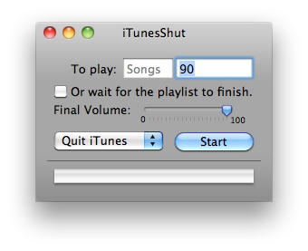
So for about a year now I've been trying to find out ways to quit and launch apps on Mac OS X at specific times of the day. This is especially useful when I run BOINC because my computer never sleeps at night anymore. Initially it was just iTunes that I wanted to quit after a set number of minutes, and I would use this nifty little application called iTunesShut. Here's a quick screen shot of it.


Basically, as you can probably tell by the screenshot after a set amount of time or at the end of the playlist (or songs) you can tell iTunes to quit, pause, and even tell the whole system to shut down or sleep. However, this application is only limited to iTunes.

Cronnix
After a while I realized I wanted something that could launch or quit ANY application on a timely basis. I would try to google applications that could do this but I couldn't find a solution. However, yesterday I saw this application called Cronnix. The website describes this application as "a GUI frontend to the powerful Unix tool "cron". Cron is a Unix system service that allows scheduled execution of scripts, programs, applications - in short anything that can be started from the command line. This includes OSX applications and AppleScripts." In short, this can be used to launch applescripts, meaning that I can launch and quit applications at will. Now, while I dabble a bit into the tech world I am by no means sa programmer. So I continued to google for how to set up an applescript to launch an application.

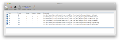
Before I talk about how to setup an applescript I'm just going to quickly talk about Cronnix how to use it to launch scripts in the first place. So, when you launch the application it should look something like this, however, without the tasks.


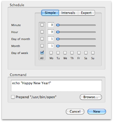
To start a new task you click the "new" icon at the top left (fairly straightforward so far, right?). YOu will then be greeted with this screen. At first I was unsure what the screen was supposed to do (I had thought that cronnix was a timer based app, where I could execute a task after a set amount of time, but I was wrong).


This information is also in the cronnix help file as well (if you go to the help menu), but I'm going to go through it anyway. Minute and day are for the time of day you need to run the script. And it's 24 hour time, so just a quick note there. So 23:30 would be 11:30 pm and so on. As for the month and day, if you need to run the script every day make sure you check the box and you see the asterisk in the box. That means it'll run every day.

Applescript
I have used applescripts in the past (at one point in time I wanted to launch all of the applications I used at once using an applescript. However, I quickly realized that the application would have to fully launch before the next one would run. That disappointed me at the time (where I wanted all of the applications to launch at the same time), so I abandoned applescript.

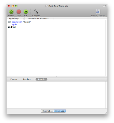
Back on topic, so I'm just going to quickly paste the commands for running and quitting a script. It's actually quite simple. First of all, launch the applescript editor.

For launching an application
tell application "[insert application of choice here]"
launch
end tell

For quitting an application
tell application "[insert application of choice here]"
quit
end tell

Here's a quick screenshot of how it looks like.


One thing I noticed was to run the script before hand to make sure it works. Sometimes the applescript editor is unsure of which application you are referring to and an extra dialog box comes up. Select the application you want to launch or quit and click "done." Now to save the script. Go to "file" and click "save as," and make sure it's saved as an application and not as a script.

Back to Cronnix

So now at the dialog screen at cronnix check the "prepend usr/bin/open" box and click browse to go to where the applescript was saved. Once you've selected the script click "new" in cronnix and the task is set. While in cronnix you can choose to run the task to give it a final check, where you go to "task" and then "run now." While in cronnix make sure you click the "save" icon to save the task. The nice thing about cronnix is that since it's a system feature you don't need to open cronnix to run or quit the app! It's done all in the background, so automatically at the set time the script will run and there you have it, an automated mac.

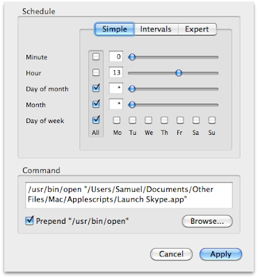
One last screen shot to make sure all is well.


So in this script I'm telling skype to run at 1 pm every day. And that's it! I hope you enjoyed this tutorial. Leave a comment if you have any questions, and I will try my best to answer them (I did just discover this all yesterday, after all).

Tuesday, June 12, 2012

BOINC Update

It's been a while since I talked about BOINC so here's a quick update post regarding what it's been going. So I used boinc extensively for the first few months but then I stopped for a couple of months. I stopped because I just couldn't get the settings right, where I wanted two processor settings for when the computer was in use and idle. This just wasn't possible with the BOINC manager so I got frustrated and stopped using BOINC. But about two months ago I restarted my BOINC journey, where I tried to only participate in one project that I cared about. Initially I thought it would be the World Computing Project but then I realized the times were just too variable and I went to rosetta@home, where the project times are user configurable online at their website here. Before I also tried to run BOINC only when my computer was idle for a set number of minutes, but I found out this time that I could actually run BOINC as I was using the computer unless I am on youtube or another flash site. I also refined my processor and memory usage configurations, which I will also talk about. But, first for the screenshots. At this point GPU computing using AMD graphics cards on the mac is still at its infancy, so I do not use my GPU to do any computing.

So this is how my project page looks like at the moment. Pretty simple, I removed all the other projects and used rosetta@home for my main project.


Theses are the current active tasks I have, there's a good number of them because I can potentially run 8 tasks at once. Some are "waiting to run" because I've restricted my memory usage, but when the computer is idle there should be 8 tasks running at the same time.


Just a quick screenshot with my credit statistics on a daily basis.


Memory Configuration
So now a quick look at my BOINC settings. When I first ran BOINC I tried to run it even when I was using the computer, and I found out that BOINC was just using too much memory at once (plus I was using firefox), even when the memory at idle was restricted to 50%. Perhaps this was fixed in the latest release (or I just didn't notice it before) but I set memory restriction to 40% at idle and it's been running far better, where if I start using the computer the application would give back some of the memory, where more tasks would be "waiting to run" as compared to "running."

CPU Configuration

Memory configuration was pretty simple, it actually took me a while to figure out the optimal CPU settings, since it had a direct relation to temperature. I would have to change the CPU settings depending on the computer temperature (which I monitor with istat menus). Right now I have BOINC to use 100% of the processor at a 15% run time. I no longer need to change the processor settings, though I do snooze BOINC when I go on youtube because flash is still quite processor intensive. At this point, even with all my usual apps open (WEb browser, Sparrow, Flux, iStat menus, Radium) the processor is at 67 degrees celsius and the fans are at 2000 rpm, with the enclosure being 334 degrees celsius. Previously I thought it was imperative to have the CPU temperature at low 60's at night but over time I realized it didn't matter as long as the fans were at the lowest setting (I do not run SMC fan control). I do monitor the temperature over time, hwoever, and snooze BOINC if necessary.

So there you have it, a quick update on my BOINC status. Happy Computing!

Macbook Pro 15'' (Early 2011) Update

I was initially writing a post regarding the new 15'' macbook pros that came out very recently, but the more I started typing the more I realized that I kept referring how I was doing with my current setup (the early 2011 15'' macbook pro) so I decided to first have a post about my thoughts on the older model. I hope to do an update on my BOINC operations in another post (this one is quite length already).

So about a month ago I reinstalled the operating system, since when I first started using this computer all the data and settingswas transferred using the firewire 800 cable. THis to me wasn't as optimal since I was porting old settings into new hardware. Since it was the summer and I had a bit of free time I decided to erase the partition and reinstall. I've actually come up with a template of what files to backup (I'm going to post this at a later time), so overall the process was fairly efficient. It was mainly just waiting for files to transfer through ultra slow USB 2.0 (I wish I had a couple firewire 800 drives, alas).

Backing up
In terms of backup I actually came up with a new procedure. So I have three hard drives, one 250 GB, one 500 GB, and one 1 TB. Initially I would use time machine on the 250 GB hard drive to back up information on the 500 GB and 1 TB hard drives, as well as data on the macbook pro. Then I was thinking that backup was incremental, since it uses time machine. Though, I found that this method was not as efficient as I had hoped, where some files I rarely change (Ex: family videos). So the 250 GB time machine partition was actually taking up unnecessary space. In the new setup on the 250 GB hard drive I have a time machine partition and a blank partition. I use the blank partition as a one way synching device, to sync data from other drives to this one. This is since I do not require incremental backup for some files while for others (Ex: school documents, system files) do. I am also considering using google drive or dropbox to backup some of my school files online but I have not come to a final decision.

Filesync
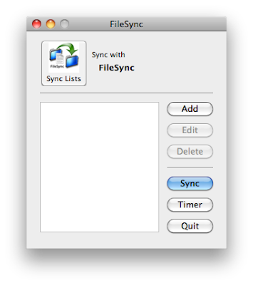
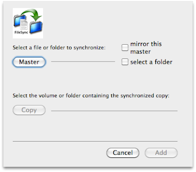
After I made the blank partition I wanted to fine a free application that would do one way synching and I found an app called filesync. Here's a quick screenshot of the application. It's nothing fancy and doesn't come with the spark and dazzle of many mac apps but it does the job and does it well.


The interface is self explanatory. To sync folders one way you select the "add" button where this new dialog comes up.


So it actually enables one way or two way sync. To have one way you choose a "master" file, and select to mirror the folder and its contents (which was what I had selected). Then later you select the "copy" option and the destination. You can do this with multiple files, and when ready click "sync" on the main menu. Then it starts to transfer files. One thing i thought could be improved about the application is that it didn't show the speed or the approximate time where the synching would complete. There was only a box showing which file was transferring and it did not mention where that file was located. But this was not a huge issue for me so I waited for it to finish.

Browsers (Firefox vs Chrome)

After I reinstalled the operating system I was considering whether to switch browsers to google chrome as my main, because its load speed from the dock quicker than firefox. Plus its system performance is far better in terms of memory usage and processor percentage than firefox due to its architecture. I also found that most of the addons that I use on firefox are available on chrome. The adblocking functionality of chrome has also improved significantly since its inception. I also love using greasemonkey and stylish scripts on firefox, but on chrome I could install the scripts as is, without the extension. In the end I transferred my bookmarks over to google chrome, though over time I found some quirks of chrome that weren't exactly favorable.

The first thing I had an issue with as importing bookmarks. I used the built in browser option in google chrome to import my firefox bookmarks, but I found the function to be faulty. Some bookmarks were simply not transferred over to chrome (Ex: unsorted bookmarks folder), and what I had to in the end was export bookmarks using the bookmarks manager in firefox and import the file using chrome. This way all the bookmarks were imported correctly.

Second of all I had issue with was the bookmark manager in chrome. The firefox bookmarks manager was by no means perfect, so the mnanager-in-a-tab was a new experience for me. I personally favor having the bookmark manager as a tab because sometimes I like to compare folders, and having two managers open side by side (windows 7 style) really makes it easy to do so. But I had an issue with the bookmark manager (I'm not sure whether this "feature" is intended or not) where if I delete a bookmark or a folder I would need to refresh the page to see the changes. The first time that this happened it drove me crazy trying to find out what I had done wrong, because I had delete a folder but still saw it on the sidebar. That made me think that the folder was still there, and I had to keep trying to figure it out until I found out I just needed to press the refresh button to notice the changes.

Third (albeit an obvious one) was privacy issues. I really did not like how chrome kept all your history, download history, and other browser data until you clear it manually. There is no extension to clear them automatically, and I found it to be an annoyance. On firefox I had it set to delete everything on exit (even adobe flash information), for the sake of privacy. So theoretically if you go on facebook then close the browser, open it again the facebook will be at the login screen. I know there is an option on chrome to block some sort of third party content, but it was interferring with my youtube script so I had to leave it unselected. I also had to select all the features that would automatically send data to google, for example their instant search options.

Fourth was that the google chrome store is hard to browse for the addon you need (though I suppose this could theoretically be an issue on every browser). Just a couple days ago I tried to find an addon that could close the browser based on a timer that I can set. THis is because sometimes I like watching streams before I sleep and I fall asleep before closing the browser and stream. This would waste bandwidth and system resources (since I have a internet usage limit and I run BOINC at night). I could not find one in the end, though in retrospect it could have just been that such an extension was impossible to create. But I did try for a good 15-30 minutes.

Fifth was the zooming feature in chrome. If there's one thing I know firefox is doing extremely well it is the zoom feature. This is pretty much if a website's font is far too small you could just control/command +, to enlarge the text and page size. In comparison to firefox their zooming feature just falls short. SOmetimes I try to zoom in and the page warps and I can't see part of the page, or the text just doesn't zoom very wel. I know for many this might be an nonissue to but to me it was just plain annoying. I also noticed at times when I zoomed in chrome the website layout would be distorted.

Sixth was tab management. In firefox I have to keep an addon called "tab mix plus" to manage how my tabs behave, and the good thing is that chrome does many of the things by default, like right clicking a link and closing tabs to the right. However, when it came to many tabs I could barely see the tab at the top of the page. Firefox has a solution for this, where you can scroll left and right to see all the tab names and I hope chrome comes up with a solution as well.

As of now I still have chrome as my default browser, because I like opening links from my rss feeds into chrome, which has better memory performance than firefox. But for browsing and actually logging into sites I still use firefox. So right now I use the two browsers side by side. I use safari once in a while to access pages I want to support with ad content, since I have adblocker on chrome and firefox. So an example would be some streams, but I've noticed that when the flash ads come it takes up a lot of processor activity, which I am not very happy about.

General Applications
During every renewal of the operating system I look through my applications folder and decide which apps I didn't really need. Startup applications are especially important since they influence booting time, but right now I have seven start up items. I had fewer items before but as time went on I just kept adding more. They include, BOINC, gfx cardstatus, sparrow, growl, alfred, flux, bettertouchtool, and istat menus.

I've had all of these applications running at startup before, though alfred is a new one (I installed it for the first time after the reinstall). Alfred is similar to quicksilver in that it's an application and file launcher. I switched mainly because I found quicksilver to be slow, even though developer updates were coming. I wanted to see what else was on the app market so I decided on alfred, which had good reviews. I'm sure there are numerous reviews out there, but I mainly use alfred for opening applications, setting up key triggers for launching folders in the finder, and to open and browse finder items. One thing I really like about alfred is that it uses the built in spotlight index, while quicksilver it had its own database.

Hardware
In everyday performance I'm quite satisfied with the macbookpro, though if I had a wishlist I wouldn't mind having a SSD (I'm eyeing the 256 GB one in the newer model), but a more pragmatic approach would be just to geta 7200 rpm drive instead of 5400 rpm (which I currently have). I have yet to do research on heat issue (which should be minimal from what I've found so far), but I have no plans to upgrade since the current hard drive is working fine. Also, out of 500 GB I've used roughly 292 GB of it, in part due to the windows partition (100 GB), and the rest from the mac partition. I tend to max out my RAM pretty often because of BOINC using a huge chunk of it.

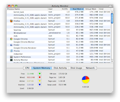
Here's how it looks in activity monitor 90% of the time (sometimes I need to snoozequit BOINC if I really need more memory for the browser).


I find that when the discrete graphics card is on (AMD Radeon 6490M), the computer gets noticeably hotter. Recently I've been running gfx cardstatus to force the gpu as the integrated one, which I did last summer as well. I notice the computer being a few degrees cooler that way, which is good for BOINC (I don't like BOINC running my computer too hot since after all it is a laptop).

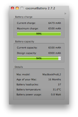
For my previous macbook pro I was hugely disappointed in the batter capacity and how fast it degraded. Here's a shot from the coconut battery app.


As you can see the new batteries are far superior to the old sony removable batteries I've had in the past. It's been well over a year but the capacity has only changed by a couple of percentages. The loadcycles for the computer is still fairly low, but I try to put it on batter once in a while and let it run for a bit (until 70-80%) then charge it back up. I also try to calibrate the battery once in a long while, though this is more of a challenge now with the larger battery capacity. It takes a very long time for the battery to finish, really.

As an ending note here's a screenshot of my desktop. I've been using another wallpaper for some time, but I recently looked at apple's collection and I liked the new mountain lion wallpaper due to the cooler colours. I just found it wasn't as "busy" as the lion wallpaper.


So I'd say, one year later, computer is still as snappy, and no hardware issues.

Why not upgrade to Mac OS Lion?
One last point, regarding "upgrading" to lion. In the past I've been pretty eager to upgrade to new releases of Mac OS X, but this time I've been more cautious. I've read many reviews of lion and even though some features are cool (Ex: filevault 2) overall I do not consider it an upgrade over snow leopard. I suppose the upgrade is "necessary" if you are an iPhone perhaps icloud user, because snow leopard sadly does not support icloud (which still baffles me by the way). Because, in the end, despite such enticing features there's just some functionality in lion that I think would drive me crazy. I am not a big fan of the new document saving system at all, where having backup copies of the document is good but taking out the "save as" dialog is not the way to go.

I also dislike the new "mission control" feature in lion, where I see spaces and expose is a far more efficient way of handling open windows and applications than mission control. I've tried out Mac OS Lion at the apple store and it just baffled me how I could move a window to another space, but I could not move the window back. Taking out an easy way to access assigned spaces is also a step backwards from apple.

Having a full screen is a new feature, but I've read so many threads where a secondary display is attached to the laptop, and in full screen it just adds that fabric-like background to the secondary display. THis misstep, to me, is horrifying. How could apple not take this seriously (there is still no fix in lion) and I'm not even sure whether they consider this a real issue.

The loss of rosetta is another thing; I have jam packs and during their installation rosetta is required. It's not even third party software but in lion I would be unable a piece of software from apple itself, which makes me uneasy.

I've considered the pros and cons of installing Mac OS Lion for a long time now (I have a copy of it). Even though I like to be on the latest and "greatest" I feel that snow leopard, despite its age, outperforms lion in terms of providing the optimal desktop experience.

Monday, June 11, 2012

New 15'' Macbook Pros Early 2012 Oh My!

I had a bit of time today and I've been following the WWDC 2012 fairly closely, so I've read about some of the rumors and about what people expect to see. I'm personally not that big of an iOS fan, nor am I that interested in the next iteration of Mac OS X. On a side note, I personally think that by iOS-ifying the operating system, the user experience has been severely compromised. I am still using Snow Leopard 10.6.8 at the moment (I actually reinstalled the operating system about a month ago). But that is another topic, what I would like to compare is my current system, the macbook pro 15'' (early 2011), to the system that just came out, the macbook pro 15'' (early 2012) model. My macbook pro isn't really "oudated" per se, there has been one revision in between, and even for that revision it was just a slight bump from my configuration (so the base model is actually the mid range model from the early 2011 line). To clarify I will be doing a comparison of base models for both years.

I hope to go through all of the specifications of the two machines and then give some of my thoughts and opinions regarding them. Some components I agree are a pure upgrade, and there are no detriments to the overall system. But I do have some queries as to the design decisions apple has made regarding the new model, which I will discuss in detail.

Macbook Pro 15'' (Early 2011) Technical Specifications; taken from everymac.com as well as the system profiler

Processor: Intel Core i7 Quad Core
Processor Speed: 2.0 Ghz
RAM: 4 GB (DDR3) 1333 Mhz
Video Card(s): AMD Radeon 6490M (VRAM: 256 MB)
Intel Integrated HD Graphics 3000
Display: 15.4'' Glossy LED-backlit TFT display
Display Resolution: 1440x900
Camera: Facetime HD

Wireless: 802.11 a/b/g/n
Bluetooth: 2.1+ EDR
Hard Drive: 500 GB 5400RPM SATA (at least mine was)
Superdrive (Y/N): Yes
Battery Capacity: 77.5W
Dimensions: 2.4 cm (height) x 36.4 cm (width
Weight: 2.54 Kg
Sound: Stereo speakers and microphone

Ports
-Magsafe
-2 USB 2.0
-Gigabit Ethernet
-Firewire 800
-Thunderbolt port (minidisplay port)
-Headphone jack
-Audio in
-SD card slot
-Laptop locking port

Macbook Pro 15'' (Early 2012) Technical Specifications; taken from Apple
Processor: Intel Core i7 Quad Core
Processor Speed: 2.3 Ghz
RAM: 8 GB (DDR3L) 1600 Mhz
Video Card(s): Nvidia Geforce GT 650M (VRAM: 1 GB)
Intel Integrated HD Graphics 4000
Display: 15.4'' Glossy LED-backlit TFT IPS Display
Display Resolution: 2880 x 1800
Camera: Facetime HD

Wireless: 802.11 a/b/g/n
Bluetooth: 4.0+ EDR
Hard Drive: 256 GB SSD
Superdrive (Y/N): No
Battery Capacity: 95W
Dimensions: 1.8 cm (height) x 35.89 cm cm (width
Weight: 2.02 Kg
Sound: Stereo speakers and dual microphones

Ports
-Magsafe 2.0
-2 USB 3.0
-2 Thunderbolt port
-Headphone jack (compatible with apple mic/headphone set)
-SDXC port

Processor, RAM, Hard Drive, Video Card
In terms of these three components, the new macbook pro is leaps and bounds over the previous model. It supports the latest processor, increased memory (4 GB to 8 GB), and finally sports a solid state drive. My first macbook pro (before it got replaced) had 2 GB of RAM and for everyday use I consistently maxed out. As for 4 GB, I run BOINC, so I let it use up to 2 GB of memory, which leaves me at near maximum (right now I have 3.87 GB used out of 4 GB). I recently read multiple articles saying that the new macbook pro really isn't user replaceable. That does disappoint me, because components do break down (especially hard drives). Even though the new model comes with a pretty large SSD, it just feels wrong not be able to replace it for whatever reason.

And lastly for hard drive I have a 500 GB hard drive, where I've partitioned 100 GB for windows leaving there rest for mac, and I still have 210 GB available. So in the end I've used roughly 190 GB of hard drive space. Personally I love archiving files, I also keep a 82 GB iPhoto library along with application files, and couple gigabytes of music files for iTunes. If I had 256 GB for total hard drive space I would still partition 100 GB for windows, and move off my iPhoto library to an external drive. All in all, there is no debate it is an upgrade in all three categories. One last note the video card upgrade is a no-brainer,

Display

The "retina" display on the iphone and ipad has gotten a lot of attention, with many hoping it would move on to the mac ecosystem and it has. I fully agree that having a retinal display on the phone makes a huge difference, but after handling the second and third generation iPads I feel that the difference is not as distinct in my opinion. In my mind this is a very good upgrade, but I hope to determine after actually using the new model at an apple store. But, as with other apple devices, I'm sure the addition of a "retina" display adds a lot of hype.

Ports
First, the magsafe 2.0 port; for my first macbook pro I had the original magsafe, which very similar to the new magsafe 2. I personally did not have any issues, design or otherwise, with the magsafe connector. j I was very careful with it and did not yank it to unplug the connector. However, I am aware that for other users there have ben issue fo fraying at the connector, which got apple to redesign the magsafe connector to the new "L" shape they have now. Personally I like the original design of the magsafe, because with the current connector that I use there is only one "right" way to connecting it, since if I flip the connector 180 degrees, it would block up the ethernet port. However, as with the original connector I've had no problems with it. Since it just came out, I don't know what new design features are incorporated into the connector but all I know is that the connection is smaller and it reverts to the original magsafe design. I hope to try out the magsafe 2 connector at an apple store, but I am disappointed that the new connector is not compatible with the old one (who would have guessed), so for plugging the old connector into the latest model macbook pro an adapter is needed for the low price of $10.

I personally love using the ethernet port on my current macbook pro, since I love having a direct connection to the router, especially when it comes to gaming. I find that when I download files the speed is far superior to a wireless connection, so I question the removal of the ethernet port on a 15'' machine. Of course, apple now has a dongle for thunderbolt to ethernet, but personally do not appreciate this change.

Now for the two thunderbolt ports and the hdmi port. This part leaves me quite apprehensive about the change. To me, thunderbolt to me is a very niche connector, where the market for it is still very small at the moment due to pricing. I've never used the port myself but I in the past I've considered a minidisplayport to hdmi adapter. However, I do not own a HD TV so buying one would be pointless. This adapter from monoprice was the one I was looking at, and though the price is cheap I have no need for its function.

So back to my original point, if having one thunderbolt port is barely necessary (one is enough if you want to connect to an external monitor), what is the point of having a second one, plus a hdmi port. Actually, I am just bewildered as to why they would include a hdmi port. Minidisplay can easily switch to hdmi (linked already provided), why is there a need to have another hdmi port on the computer? This, to me, just does not make sense whatsoever.

In the end, the addition of some ports (and subtraction of others) leaves apple to provide new dongles, such as thunderbolt port to ethernet. An interesting move is the abandonment of the firewire 800 port, but the hilarious part about this decision is that apple provides yet another dongle for thunderbolt to firewire 800. These multimedia port decision just leaves me so frustrated with apple.

The audio in (or microphone jack) has also been taken out for whatever reason, and is replaced by a headphone jack not unlike that in the current 13'' macbook pro (where you can use apple mic/headphones and it'll still work with the one port). The machine gones with USB 3.0, which is a welcome upgrade (though I still wish it would come with more than 2 USB ports, I can wish can't I?).

Battery and Superdrive
Since there is no longer a superdrive in the new model, and the hard drive has been shrunk from the traditional sata drive to solid state storage, the batter capacity of the new macbook pros has been increased, from about 75W to 95W. This is a welcome change, though even with my current macbook pro I have never run out of battery. I run gfx cardstatus, so when I'm in battery mode I switch over to the intel integrated graphics and the battery life is extended by many hours. Though I suppose that due to the increased pixel density of the screen a larger battery would counter the increased power consumption of the screen.

As for the superdrive, I personally don't mind having a superdrive but Know there are many who absolutely find no use for it. I burn rewritable media once in a while, for backup and also to transfer files to others, and also to watch DVDs once in a long while. So I would not mind having a superdrive, though it increases the heft of the machine. In the end, due to the ailing nature of DVDs it would depend on the needs of the user but it is still a worthy upgrade.

Last thoughts
The weight decrease as well as a thinner body is quite nice. For me with the older macbook pro, I always notice the heft whenever I carry it. I watched the video of designing the new macbook pro on the apple website and the new fan structure was quite awe inspiring. With an discrete graphics card on the lose it really does increase internal temperature of the machine, and having more vents is a straightforward approach when it comes to heat issues. I also wonder about whether the new fans are indeed quieter than the old ones. For the older version when I browser the internet I don't hear the fans unless it's youtube, but when I do it the sound is noticeable. Typically during the summer I try to restrict the GPU to the integrated graphics which helps preventing the computer from getting too hot.

Thursday, March 1, 2012

New Layout, Oops

So I was bored one day (today) and was wondering what new enchanting templates were available from google. Looks like there's no turning back now so if you have any suggestions let me know. I'll play around with the design when I have time.

Edit: I really didn't like the font and previous template (I find I like serif fonts far more than sans serif), I also changed the width to fit my monitor (before I would have to keep zooming to get a good font size). Note that I made such changes to optimize my personal viewing of the website, and though I hope such changes are aesthetically pleasing to you as well, if you have any thoughts or comments in regard to the layout of the blog leave a comment and I will gladly take in your feedback and change the layout if necessary.

By the way, more posts coming in the next few days!

Google Calendar Theme Change (for Firefox)

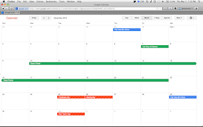
So if you're a google calendar user you probably know that google has taken out the old layout because it was "impossible" to maintain two layout. As well, their stance is unwavering. And, if you're like me, you aren't really a big fan of it (though they have recently added a number of new colors that are easier to see). This post is mainly for Firefox users since I'm going to talk about greasemonkey and stylish, both found on the firefox browser. Though I belive that you can run greasemonkey scripts on chrome but I will not talk about it here. So in this post I'm going to show you what I did to go from this (original)


to this


At least for me, it is far easier to see the actual event names and the screen space is used properly, unlike in the first picture (black text to white text). Plus, the space is used better as there is more space for the calendar.

Well, two of my favorite websites when it comes to tweaking websites to your liking is going to be userstyles.org and userscripts.org, with the first one catered specifically to greasemonkey and second to stylish. Now for stylish they do give you options to covert the script to greasemonkey which means running less addon but I guess I'm lazy so I have both addons.

Step 1. Download Greasemonkey and Stylish.

Step 2. The first script to download is found here, called "google calendar better 2011 style." Just click the blue "install with stylish" button and you're done. What this script does (Straight from the website)
- white event and task text on all colors
- classic yellow current day highlight
- grey hour label bg color

Step 3. The second script to download is found here and is called google calendar bars toggler. As its name suggests it allows you to hid the headers and other elements on the google calendar you are not likely to use (ever). It provides arrows (and keyboard shortcuts) for you to toggle their hidden state. The steps are similar to the second where you just click the install button.

And that's it, with these two scripts you can hopefully like google calendar a bit more. For chrome if you go to the script sites I'm sure they provide instructions to install the script as an addon (I've tried this with other scripts), though if you have any questions you can ask in the comments.

First post of 2012? Quick thoughts.

Well I guess it's evident now that it is not possible for me to maintain this web page during the school year. And by maintain I mean post new articles here and then. I have some ideas for new posts but I just haven't had the time (or motivation) to use these ideas and actually create the post. I am now going to spend a couple minutes to go through some quick thoughts that I've had on recent events in no particular order.


Windows 8 Consumer Preview

Nice name by the way, apparently "beta" is too mainstream. Disclaimer: I haven't personally tried windows 8 (though I would very much like to, and I'm not talking about virtualizing it here. I want the full experience.), but I can't help but say that it's kind of like mac os 10.7 lion. There are some features that I really like, such as the new windows task manager (I find the layout very informative and the colors convey the information efficiently), and I'm talking about the detailed view here.

Though I don't know whether this metro interface is the way to go, with the start menu "gone." The metro UI does not facilitate an efficient desktop experience. Say you just want to search up a program to start up, you would have to press the window key, then you have to find (I believe you press "control-f" to search all apps, and then select the app that you want to launch. But the thing is, the change is too drastic. The change from the desktop to the metro interface just seems so jarring, like I'm moving from one experience to another. I really hope that microsoft provides a way to disable the metro interface. That and a tweak to put back the old start menu and windows 8 would be good to go. In the end I actually have some faith in microsoft on this issue, where they will listen to customer demand and provide options (unlike apple and snow leopard/iCloud).

In the meantime I will consider downloading the consumer preview, though I will have to find some sort of external hard drive or USB drive to store the temporary windows 8 partition. I don't really have that much time at the moment, perhaps I will do that over the summer.

Google Calendar
I have been a longtime user of google calendar, but a recent change has really infuriated me, and continues to lead me to believe that Google is definitely evil. Google calendar recently eliminated the option to view the calendar in the "classic view temporarily." And they did this pretty suddenly. During the whole time I was using google calendar I received no message, no email about the change. Google said they gave some warnings in advance but for me personally I had no idea they were going to change. And I wouldn't be so vocal about the change if the new layout wasn't so bad. But it is atrocious, where the colors are horrible and the layout is not efficient with space at all.

These days when I have time I'm still trying to find a good replacement for google calendar, so that I can view it on the desktop. I thought iCal would be a prime candidate, but then the font is far too small on the calendar, and there is no way I can change it (I'm talking about snow leopard here). Outlook, turns out, doesn't even support the CalDav protocol. Busycal is very functional but is far too expensive (I'm not paying $50 for a calendar).

Oh yes, this also relates to google, though not specifically to google calendar. But one time I went to google groups to "discuss" the new calendar changes only to find that google had messed that up too. From the old, comfortable gmail-esque layout to the new repulsive layout. For whatever reason the site used up a lot of browser resources too as it was laggy and almost unusable. It behaved a bit better on chrome but seriously.

Last thoughts/Apple
I find that these days I'm losing faith in the big tech companies (I'm looking at you, microsoft, apple, google). Microsoft, well, they've been losing ground for a while now (though some faith was restored in windows 7), the metro interface is not useful in a desktop environment. For apple 10.7 was a disaster (when compared to previous releases, and in this case I'm talking about 10.4-10.6), where apple is slowly clamping down on the desktop OS, and they're not giving users a lot of choice at all. I'm still running snow leopard right now, and I'm not optimistic about mountain lion. I like how they're moving over to an iOS-like environment slowly, but some features are just not refined. I do hope that in the next iteration of OS X such features will be more refined, as in better multi-display support, and better application management when it comes to virtual desktops. I'm talking about issues such as versions and full screen mode multi-monitor support. However, typical Apple doesn't listen to customer feedback, and has said nothing about it. And Google has so far proved itself to be an evil company, with their tracking cookies bypassing browser restrictions (a la safari and internet explorer), and their new policy where they can use all your usage data (from gmail, youtube, etc.) to form an overall comprehensive picture.

I also realize that I am kind of schizophrenic at times, you might say, as I was so intrigued by BOINC when I first started using it. Now I no longer have it on my system. Though, over time I realized one thing. It is that my mac warranty expires in march 2012, and if I keep running BOINC I fear that since the computer runs at a hotter temperature that it'll break down easier. Though if I ever do build a desktop in the coming years I'll run BOINC on that for sure (since I can replace the parts far easier and cheaper than that on a laptop).