Thoughts. Technology. Tweets
Wednesday, August 7, 2013
Blog Move
I have decided to transfer my blog to wordpress, at https://picotweet.wordpress.com/. I'm still working out what I want for the new blog, hope to see you there.
Wednesday, August 15, 2012
Reeder Mac App Review
I've been looking for an alternative for a while now, to replace the aging Netnewsire (which does not seem to be maintained any longer). A prime candidate, or a much touted one at least, is Reeder. It is available in the Mac App store for $4.99 at the moment, so I decided to give it a run. Note that initially the application was closer to $9.99, so the price has gone down. I will conduct this review in comparison with my current RSS feed reader, being Netnewsire, in terms of customizability, user experience, and features. This review will reflect my workflow when it comes to RSS feed readers so our opinions might differ. I will then go through an in-depth comparison of every preference in each application and talk about various pros and cons. I will show screenshots from both applications, where I have similar RSS feeds set up for each. I will have more folders for netnewswire because I archive the articles in the application itself as I do not have google reader sync set up (more on that later).
General Interface
Netnewswire

Reeder

In terms of interface they are pretty similar. The both sport a three paned interface, where on the far left are the subscriptions and folders/tags, in the middle of the application are the headlines, and on the far right are the article shorts. Reeder also has a more compact view where the far right pane is not present. Netnewswire also supports this more compact view (called the "combined view"), but in addition has the traditional view (where instead of the screen being split into middle and right pane it contains a top and bottom pane, with the left side containing the subscription list).
Preferences
If you haven't downloaded this app (I do not believe there is a trial available) I am going to post screenshots of all of the available preferences in reeder and compare them to netnewswire (and discuss whether there is feature parity, or whether one app has more options than the other).
General

One thing I really like about Reeder is the built in, "defaulted" google reader support. This makes it so much easier to read RSS feeds when you are on the go and don't have your computer with you. I have tried out google reader support in netnewswire but I found the feature to be quite buggy, and every time I try to sync my feeds there would be duplicate feeds shown in netnewswire. This process is far more seamless in Reeder. Another option part of Reeder is "readability," which appears to be a service that makes it easier to view webpages (similar to safari's reader feature), where it focuses only on the article and takes out other headers and footers that the website may have. While this does seem to be a useful feature I found it perplexing that this feature is baked into the application itself. At the bottom of the application there will always be a "readability" button, and there is no way to disable this (more on this later). Reeder also has the capability to put the unread count number as part of the application icon itself on the dock. Though it is possible to change it back to the "badge" style that is present in netnewswire.
Appearance

Even though there are a fair number of sliders in this preference pane I found the options to be quite limited. I personally like having the style similar to that of Mac OS X, so I adjusted it as such. However, in the end I was still not totally satisfied with the result. On netnewswire whole themes are available to change the entire interface of the application, and this is not available for Reeder. Even though this is a setback, it does not affect the user experience. On a side note, one thing I've always hated about the newer versions of Mac OS X (lion and mountain lion) are the monochromatic color schemes.
Syncing

Synching settings are pretty familiar, nothing much to note here. I like that you can configure how long to keep read items though overall it is feature parity with netnewswire.
Services

Now this is where it gets interesting. Netnewswire has many services built into the application, but its age shows especially when compared to reeder. I was quite pleased to see services such as evernote, safari reading list, and pocket (read it later) to be part of the list. Admittedly I have only started using such features not too long ago, but I found it very nice that Reeder supports that many services. As well, when enabled there is an option to have the service show up as an icon in the application itself, which is very convenient. Even though netnewswire does have options to post to services such as delicious and instapaper, it is mainly available through right clicking the headline and is nowhere as convenient and seamless as Reeder. Now back to the readability "issue," in Reeder I disabled readability but on the bottom of the application window there still exists a link for readability. I was quite disappointed at that.
Also, in netnewswire I can set to have the RSS feeds open up either in the default browser of my choosing or in the built in browser. This was done in the preference pane and is very simple to change. However, this is not so in Reeder. There are options to open the link in the browser but that involves keyboard shortcuts, and by default the link will always open up in the built-in application browser. While this may be good news for some, I still prefer the superior customizability of a separate browser in comparison to the built-in application browser, and there is no way to change this. While you may say that that I can still open links in my default browser the experience is not as seamless as in netnewswire, where I can just double click the link and have it open in my browser (in the background too, might I add), in this case firefox.
Reading

There are options of interest in this section, where it gives various options for the classic and minimized layout. Here it tells you that in order to open the article in the default browser you need to command click the article. This to me is a huge setback, as it is not possible to change this setting. The built-in browser is good (I tried it numerous times), but in terms of my workflow I still prefer having a separate browser. The article font is also customizable, though such an option pales in comparison with netnewswire. In netnewswire I can change the font for the subscription list, the headlines, the article summaries, the dateline, and the combined view titles. In reeder I can only change the font size for the subscription list and headlines (through a toggle) and the article font.
Gestures

Gesture support is not supported in netnewswire (as far as I know), so there isn't much to say here. I personally have not tried out the gestures since I use a mouse and keyboard; I don't use the macbook pro trackpad that often so I did not have the chance to test out gesture support in Reeder.
Shortcuts

It's also very welcome to be able to change the keyboard shortcuts in Reeder (there is no such preference pane in netnewswire), though I still found it disconcerting to have to press B (or command click) to view the article in browser. Oh yes, I was not sure where to put this but Reeder supports the "retina" resolution found in the new retina macbook pros. Netnewswire does not support this (though I personally don't own a retinal macbook pro so it doesn't affect me one way or another). In addition, it has full screen support. So in summary Reeder it has more support for recently advancement (arguably) in the Mac operating system.
User Experience
Reeder creates a very simplistic yet elegant user experience, and the theme suits very well with Mac OS Lion/Mountain Lion, with the icons and the color scheme. Personally I am not a big fan of this color scheme and I find it harder to read text especially when compared to netnewswire, where I can control the font and font size of every element of the application. Much like Lion/Mountain lion there is a bit of excess in eye candy (in my opinion). An example is the transition between the preview of the article and the full rendering, where in transition it gives a moving pane effect (like in spaces/mission control). To me, this effect is highly unnecessary, and it shows up every time I read an article (since I have to double click to get to the full article view), and it just wastes a lot of time.
Reeder is interesting in that it supports a quick "preview mode" of the article, where if you just click the headline of the article on the preview (the right pane) it shows just the text and images of the article, without the accompany header and footers. When you double click on the article it shows rendering of the article using its built-in browser. While this does make it easier to read articles at first glance does have its caveats. For sites such as Ars Technica I realized that it does not show the full preview of the article, and forces you to open the full article by double clicking on the headline. I know this is not a fault due to Reeder, but it's just annoying from the perspective of the end user. On other sites such as Anandtech the preview is sufficient and I don't need to double click on the headline. I have attached screenshots to visualize my point.
Ars Technica Article Part 1

It's all fine and dandy until the end.
Ars Technica Article Part 2

Note the "Read 1 remaining paragraphs" option on the bottom of the webpage as well as the accompany google inline text ad.
When double clicked the application shows a more rendered full view of the selected article using its built-in browser like so.

Some other aspects of the application I found to be lacking was the subscription management, where for some reason folders (tags) could not be renamed, and I had to create a completely new folder. However, this was a small issue. I also wish there was an option to turn off the date headers, as I find them to be unnecessary.
Last Thoughts
Going in I really hoped to replace Netnewswire with Reeder, but it was just not compatible with my workflow. Even though I disliked some of the design aspects of the application I could still live it. The one thing that completely ruins my workflow would be the built-in browser support. I really wish it were possible to open articles with firefox just by double clicking the headline. Alas this is not possible, and thus concludes my review of Reeder.
General Interface
Netnewswire

Reeder

In terms of interface they are pretty similar. The both sport a three paned interface, where on the far left are the subscriptions and folders/tags, in the middle of the application are the headlines, and on the far right are the article shorts. Reeder also has a more compact view where the far right pane is not present. Netnewswire also supports this more compact view (called the "combined view"), but in addition has the traditional view (where instead of the screen being split into middle and right pane it contains a top and bottom pane, with the left side containing the subscription list).
Preferences
If you haven't downloaded this app (I do not believe there is a trial available) I am going to post screenshots of all of the available preferences in reeder and compare them to netnewswire (and discuss whether there is feature parity, or whether one app has more options than the other).
General

One thing I really like about Reeder is the built in, "defaulted" google reader support. This makes it so much easier to read RSS feeds when you are on the go and don't have your computer with you. I have tried out google reader support in netnewswire but I found the feature to be quite buggy, and every time I try to sync my feeds there would be duplicate feeds shown in netnewswire. This process is far more seamless in Reeder. Another option part of Reeder is "readability," which appears to be a service that makes it easier to view webpages (similar to safari's reader feature), where it focuses only on the article and takes out other headers and footers that the website may have. While this does seem to be a useful feature I found it perplexing that this feature is baked into the application itself. At the bottom of the application there will always be a "readability" button, and there is no way to disable this (more on this later). Reeder also has the capability to put the unread count number as part of the application icon itself on the dock. Though it is possible to change it back to the "badge" style that is present in netnewswire.
Appearance

Even though there are a fair number of sliders in this preference pane I found the options to be quite limited. I personally like having the style similar to that of Mac OS X, so I adjusted it as such. However, in the end I was still not totally satisfied with the result. On netnewswire whole themes are available to change the entire interface of the application, and this is not available for Reeder. Even though this is a setback, it does not affect the user experience. On a side note, one thing I've always hated about the newer versions of Mac OS X (lion and mountain lion) are the monochromatic color schemes.
Syncing

Synching settings are pretty familiar, nothing much to note here. I like that you can configure how long to keep read items though overall it is feature parity with netnewswire.
Services

Now this is where it gets interesting. Netnewswire has many services built into the application, but its age shows especially when compared to reeder. I was quite pleased to see services such as evernote, safari reading list, and pocket (read it later) to be part of the list. Admittedly I have only started using such features not too long ago, but I found it very nice that Reeder supports that many services. As well, when enabled there is an option to have the service show up as an icon in the application itself, which is very convenient. Even though netnewswire does have options to post to services such as delicious and instapaper, it is mainly available through right clicking the headline and is nowhere as convenient and seamless as Reeder. Now back to the readability "issue," in Reeder I disabled readability but on the bottom of the application window there still exists a link for readability. I was quite disappointed at that.
Also, in netnewswire I can set to have the RSS feeds open up either in the default browser of my choosing or in the built in browser. This was done in the preference pane and is very simple to change. However, this is not so in Reeder. There are options to open the link in the browser but that involves keyboard shortcuts, and by default the link will always open up in the built-in application browser. While this may be good news for some, I still prefer the superior customizability of a separate browser in comparison to the built-in application browser, and there is no way to change this. While you may say that that I can still open links in my default browser the experience is not as seamless as in netnewswire, where I can just double click the link and have it open in my browser (in the background too, might I add), in this case firefox.
Reading

There are options of interest in this section, where it gives various options for the classic and minimized layout. Here it tells you that in order to open the article in the default browser you need to command click the article. This to me is a huge setback, as it is not possible to change this setting. The built-in browser is good (I tried it numerous times), but in terms of my workflow I still prefer having a separate browser. The article font is also customizable, though such an option pales in comparison with netnewswire. In netnewswire I can change the font for the subscription list, the headlines, the article summaries, the dateline, and the combined view titles. In reeder I can only change the font size for the subscription list and headlines (through a toggle) and the article font.
Gestures

Gesture support is not supported in netnewswire (as far as I know), so there isn't much to say here. I personally have not tried out the gestures since I use a mouse and keyboard; I don't use the macbook pro trackpad that often so I did not have the chance to test out gesture support in Reeder.
Shortcuts

It's also very welcome to be able to change the keyboard shortcuts in Reeder (there is no such preference pane in netnewswire), though I still found it disconcerting to have to press B (or command click) to view the article in browser. Oh yes, I was not sure where to put this but Reeder supports the "retina" resolution found in the new retina macbook pros. Netnewswire does not support this (though I personally don't own a retinal macbook pro so it doesn't affect me one way or another). In addition, it has full screen support. So in summary Reeder it has more support for recently advancement (arguably) in the Mac operating system.
User Experience
Reeder creates a very simplistic yet elegant user experience, and the theme suits very well with Mac OS Lion/Mountain Lion, with the icons and the color scheme. Personally I am not a big fan of this color scheme and I find it harder to read text especially when compared to netnewswire, where I can control the font and font size of every element of the application. Much like Lion/Mountain lion there is a bit of excess in eye candy (in my opinion). An example is the transition between the preview of the article and the full rendering, where in transition it gives a moving pane effect (like in spaces/mission control). To me, this effect is highly unnecessary, and it shows up every time I read an article (since I have to double click to get to the full article view), and it just wastes a lot of time.
Reeder is interesting in that it supports a quick "preview mode" of the article, where if you just click the headline of the article on the preview (the right pane) it shows just the text and images of the article, without the accompany header and footers. When you double click on the article it shows rendering of the article using its built-in browser. While this does make it easier to read articles at first glance does have its caveats. For sites such as Ars Technica I realized that it does not show the full preview of the article, and forces you to open the full article by double clicking on the headline. I know this is not a fault due to Reeder, but it's just annoying from the perspective of the end user. On other sites such as Anandtech the preview is sufficient and I don't need to double click on the headline. I have attached screenshots to visualize my point.
Ars Technica Article Part 1

It's all fine and dandy until the end.
Ars Technica Article Part 2

Note the "Read 1 remaining paragraphs" option on the bottom of the webpage as well as the accompany google inline text ad.
When double clicked the application shows a more rendered full view of the selected article using its built-in browser like so.

Some other aspects of the application I found to be lacking was the subscription management, where for some reason folders (tags) could not be renamed, and I had to create a completely new folder. However, this was a small issue. I also wish there was an option to turn off the date headers, as I find them to be unnecessary.
Last Thoughts
Going in I really hoped to replace Netnewswire with Reeder, but it was just not compatible with my workflow. Even though I disliked some of the design aspects of the application I could still live it. The one thing that completely ruins my workflow would be the built-in browser support. I really wish it were possible to open articles with firefox just by double clicking the headline. Alas this is not possible, and thus concludes my review of Reeder.
Tuesday, July 3, 2012
Launching and Quitting Applications on Mac OS X at Specific Times
So for about a year now I've been trying to find out ways to quit and launch apps on Mac OS X at specific times of the day. This is especially useful when I run BOINC because my computer never sleeps at night anymore. Initially it was just iTunes that I wanted to quit after a set number of minutes, and I would use this nifty little application called iTunesShut. Here's a quick screen shot of it.
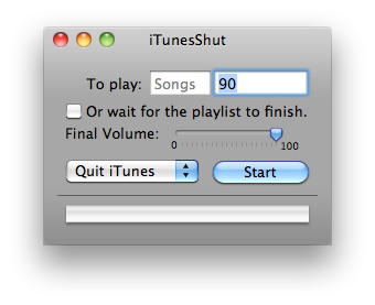
Basically, as you can probably tell by the screenshot after a set amount of time or at the end of the playlist (or songs) you can tell iTunes to quit, pause, and even tell the whole system to shut down or sleep. However, this application is only limited to iTunes.
Cronnix
After a while I realized I wanted something that could launch or quit ANY application on a timely basis. I would try to google applications that could do this but I couldn't find a solution. However, yesterday I saw this application called Cronnix. The website describes this application as "a GUI frontend to the powerful Unix tool "cron". Cron is a Unix system service that allows scheduled execution of scripts, programs, applications - in short anything that can be started from the command line. This includes OSX applications and AppleScripts." In short, this can be used to launch applescripts, meaning that I can launch and quit applications at will. Now, while I dabble a bit into the tech world I am by no means sa programmer. So I continued to google for how to set up an applescript to launch an application.
Before I talk about how to setup an applescript I'm just going to quickly talk about Cronnix how to use it to launch scripts in the first place. So, when you launch the application it should look something like this, however, without the tasks.
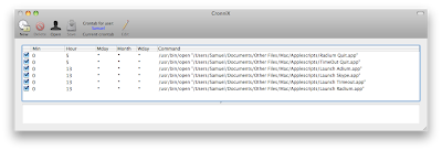
To start a new task you click the "new" icon at the top left (fairly straightforward so far, right?). YOu will then be greeted with this screen. At first I was unsure what the screen was supposed to do (I had thought that cronnix was a timer based app, where I could execute a task after a set amount of time, but I was wrong).
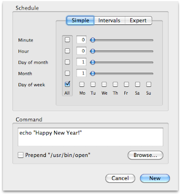
This information is also in the cronnix help file as well (if you go to the help menu), but I'm going to go through it anyway. Minute and day are for the time of day you need to run the script. And it's 24 hour time, so just a quick note there. So 23:30 would be 11:30 pm and so on. As for the month and day, if you need to run the script every day make sure you check the box and you see the asterisk in the box. That means it'll run every day.
Applescript
I have used applescripts in the past (at one point in time I wanted to launch all of the applications I used at once using an applescript. However, I quickly realized that the application would have to fully launch before the next one would run. That disappointed me at the time (where I wanted all of the applications to launch at the same time), so I abandoned applescript.
Back on topic, so I'm just going to quickly paste the commands for running and quitting a script. It's actually quite simple. First of all, launch the applescript editor.
For launching an application
For quitting an application
Here's a quick screenshot of how it looks like.
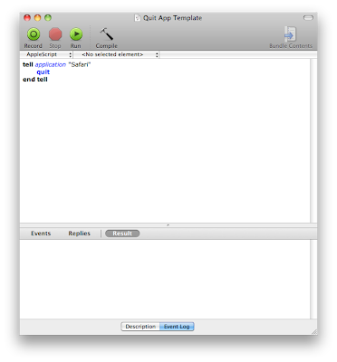
One thing I noticed was to run the script before hand to make sure it works. Sometimes the applescript editor is unsure of which application you are referring to and an extra dialog box comes up. Select the application you want to launch or quit and click "done." Now to save the script. Go to "file" and click "save as," and make sure it's saved as an application and not as a script.
Back to Cronnix
So now at the dialog screen at cronnix check the "prepend usr/bin/open" box and click browse to go to where the applescript was saved. Once you've selected the script click "new" in cronnix and the task is set. While in cronnix you can choose to run the task to give it a final check, where you go to "task" and then "run now." While in cronnix make sure you click the "save" icon to save the task. The nice thing about cronnix is that since it's a system feature you don't need to open cronnix to run or quit the app! It's done all in the background, so automatically at the set time the script will run and there you have it, an automated mac.
One last screen shot to make sure all is well.
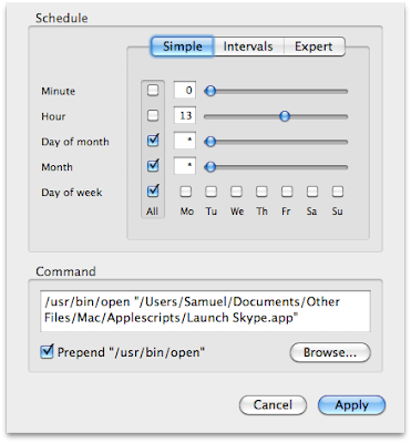
So in this script I'm telling skype to run at 1 pm every day. And that's it! I hope you enjoyed this tutorial. Leave a comment if you have any questions, and I will try my best to answer them (I did just discover this all yesterday, after all).

Basically, as you can probably tell by the screenshot after a set amount of time or at the end of the playlist (or songs) you can tell iTunes to quit, pause, and even tell the whole system to shut down or sleep. However, this application is only limited to iTunes.
Cronnix
After a while I realized I wanted something that could launch or quit ANY application on a timely basis. I would try to google applications that could do this but I couldn't find a solution. However, yesterday I saw this application called Cronnix. The website describes this application as "a GUI frontend to the powerful Unix tool "cron". Cron is a Unix system service that allows scheduled execution of scripts, programs, applications - in short anything that can be started from the command line. This includes OSX applications and AppleScripts." In short, this can be used to launch applescripts, meaning that I can launch and quit applications at will. Now, while I dabble a bit into the tech world I am by no means sa programmer. So I continued to google for how to set up an applescript to launch an application.
Before I talk about how to setup an applescript I'm just going to quickly talk about Cronnix how to use it to launch scripts in the first place. So, when you launch the application it should look something like this, however, without the tasks.

To start a new task you click the "new" icon at the top left (fairly straightforward so far, right?). YOu will then be greeted with this screen. At first I was unsure what the screen was supposed to do (I had thought that cronnix was a timer based app, where I could execute a task after a set amount of time, but I was wrong).

This information is also in the cronnix help file as well (if you go to the help menu), but I'm going to go through it anyway. Minute and day are for the time of day you need to run the script. And it's 24 hour time, so just a quick note there. So 23:30 would be 11:30 pm and so on. As for the month and day, if you need to run the script every day make sure you check the box and you see the asterisk in the box. That means it'll run every day.
Applescript
I have used applescripts in the past (at one point in time I wanted to launch all of the applications I used at once using an applescript. However, I quickly realized that the application would have to fully launch before the next one would run. That disappointed me at the time (where I wanted all of the applications to launch at the same time), so I abandoned applescript.
Back on topic, so I'm just going to quickly paste the commands for running and quitting a script. It's actually quite simple. First of all, launch the applescript editor.
For launching an application
tell application "[insert application of choice here]"
launch
end tell
For quitting an application
tell application "[insert application of choice here]"
quit
end tell
Here's a quick screenshot of how it looks like.

One thing I noticed was to run the script before hand to make sure it works. Sometimes the applescript editor is unsure of which application you are referring to and an extra dialog box comes up. Select the application you want to launch or quit and click "done." Now to save the script. Go to "file" and click "save as," and make sure it's saved as an application and not as a script.
Back to Cronnix
So now at the dialog screen at cronnix check the "prepend usr/bin/open" box and click browse to go to where the applescript was saved. Once you've selected the script click "new" in cronnix and the task is set. While in cronnix you can choose to run the task to give it a final check, where you go to "task" and then "run now." While in cronnix make sure you click the "save" icon to save the task. The nice thing about cronnix is that since it's a system feature you don't need to open cronnix to run or quit the app! It's done all in the background, so automatically at the set time the script will run and there you have it, an automated mac.
One last screen shot to make sure all is well.

So in this script I'm telling skype to run at 1 pm every day. And that's it! I hope you enjoyed this tutorial. Leave a comment if you have any questions, and I will try my best to answer them (I did just discover this all yesterday, after all).
Subscribe to:
Comments (Atom)